Image Hotspots element is used to add interactive hotspots to the images with tooltip sections. There are many customization options in the element that allow you to style the hotspot as per your wish.
The Image Hotspots element usually consists of:
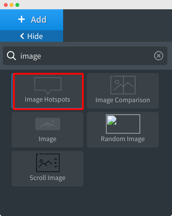
In order to use the Image Hotspots element, first, you need to click the element to add it to the page.
Once the element is added to the page, its panel will open up on the left side of the screen as visible in the below screenshot.
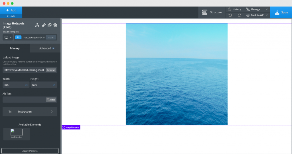
The first option in the element is to add an image on which the hotspot will be added. You do have the option to adjust the width and height of the image. Next, you can add the “alt” text to the image as well.
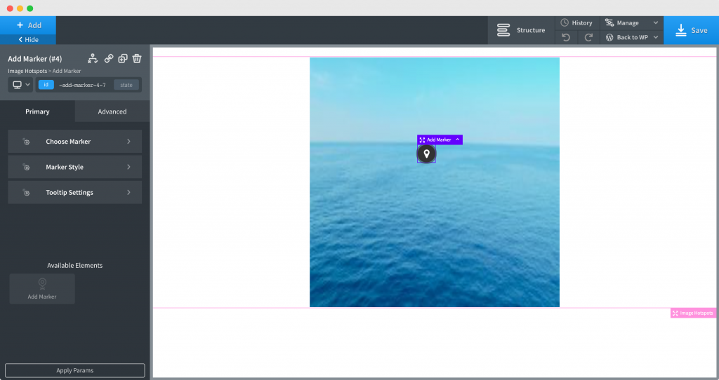
As you go ahead, you’ll see an option to add the Marker to the image.
Simply click on Add Marker and a Marker will appear over the image that you’d added in the previous step.
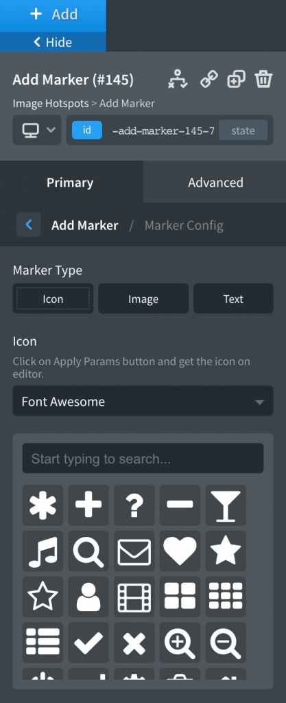
In the element panel, a new menu will appear that you can use to Customize the Marker Configuration. The menu has 3 options: Choose Marker, Marker Style, and Tooltip Settings.
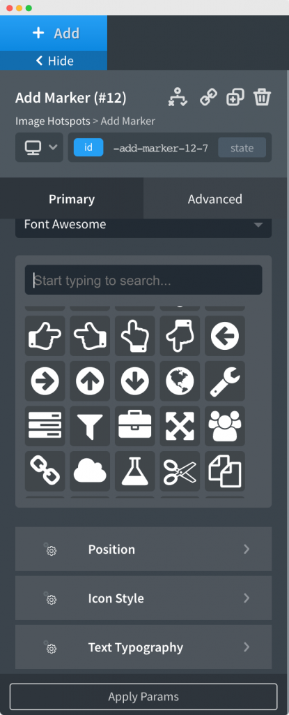
We have the option to choose 3 different types of Markers: Image, Text, and Icon.
Depending on your selection in the previous step, you can choose the Icon or Image that you want as the Marker. Once you have done that, you can adjust the position of the Marker. You also have the option to further style the Icon or Image of the Marker. Similarly, if you have chosen the Marker Type as "Text", then you can use the "Text Typography" option to style the Text.
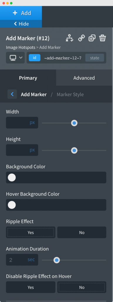
In the Marker Style menu, you can choose the Width and Height of the Marker. You can decide whether you want to give a background color to the marker or not. We also have to option to enable or disable the Ripple Effect on the Marker.
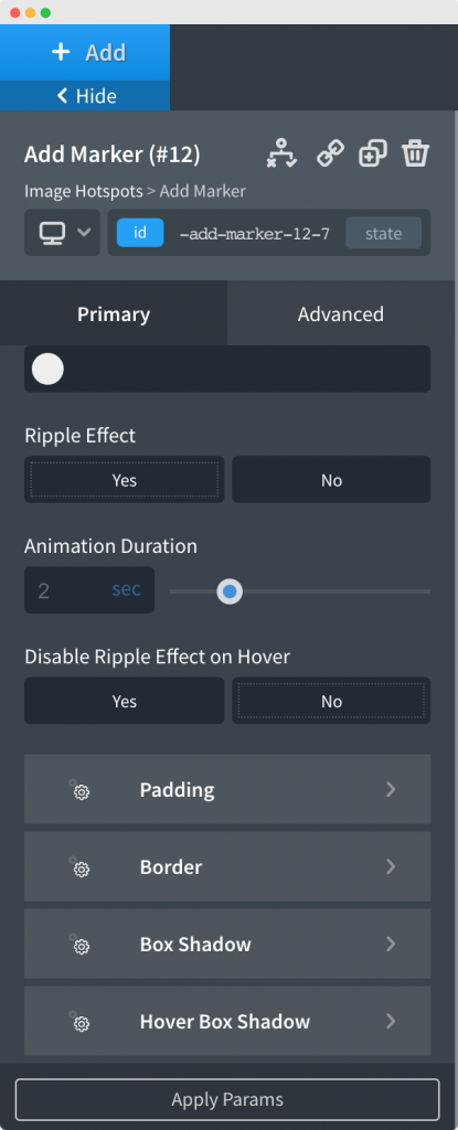
Next, you can customize the Margin, Padding, Box Shadow and Hover Box Shadow of the Marker. You can check out the below-attached screenshot to understand this further.
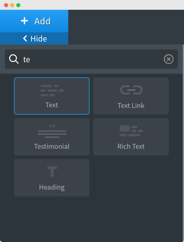
Once you have Customized and Styled the Marker as per your requirements, add a text element to the Image Hotspot. You can add a Text Element by simply typing “Text” in the Element search bar and clicking on it.
You will see that the Marker will now have a Tooltip. You now need to open the Tooltip Settings menu, if it isn't opened already.
The first option here is “Edit Tooltip Content in Builder”. You can select “Yes” here while you are editing the content of Marker Tooltip. Selecting “Yes” will disable the animation, thus making it easier for you to edit the tooltip content.
Once you have edited the content of the Marker Tooltip, you can disable the “Edit Tooltip Content in Builder”.
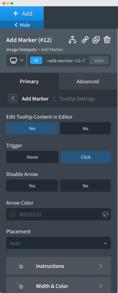
The first option here is to choose the Trigger method for the Tooltip. You can either choose between Trigger on Hover or Trigger on Click.
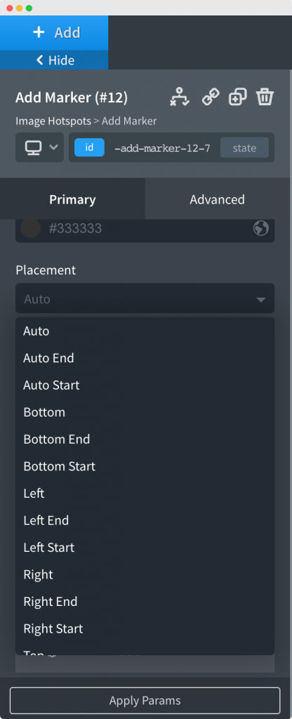
The next option here is to choose the Placement of the Tooltip. You have a lot of options to choose from like Left, Right, Auto, Top, Bottom as you can see in the below-mentioned screenshot.
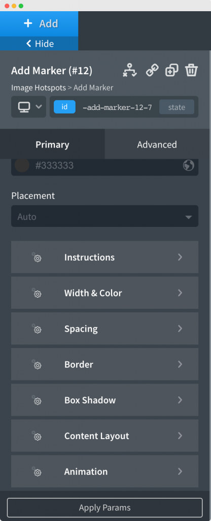
In the next step, you can choose the Width and Color of the Tooltip. You can further customize the spacing, border, box-shadow, and animations from the below section. You can check out the below-attached screenshot to understand this further.
This was all about the Image Hotspots Element. Feel free to get in touch with us in case of any concerns regarding the Element.