The Gallery Slider Element of OxyExtended allows you to create a slider containing a gallery of photos on your WordPress website using Oxygen Builder.
The Gallery Slider Element comes with multiple features that we will discuss below and get an overview of how to use the element.
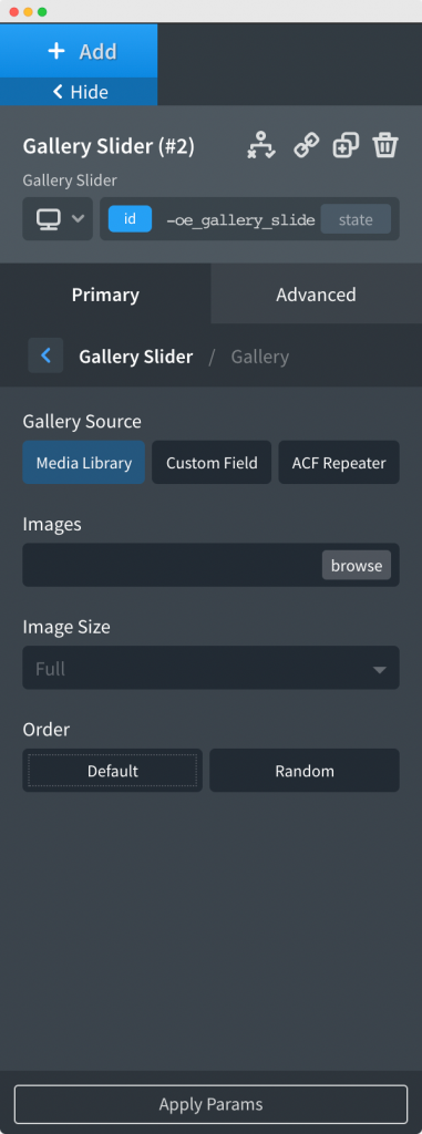
Here, you'll need to upload the images that you want to add to your Gallery Slider. You can choose to add images from Media Library or Custom Field or ACF Repeater.
Once you have added the images, you can choose the size of the images from the Gallery Tab and further set the Order in which the images will appear in the Slider. The order can be the default, i.e., the order in which the images were uploaded or any random order.
The Slider Layout Tab contains options to choose the slider type, animation effect of the slider, and the Image Fit option for the images in Slider. There are 3 types of Gallery Slider available for you to use: Carousel, Slideshow, and Coverflow. Similarly, you can choose between Slide, Fade, Cube, and Ken Burns Animation effect. You can display the images in the slider as Cover, Contain, and Auto.
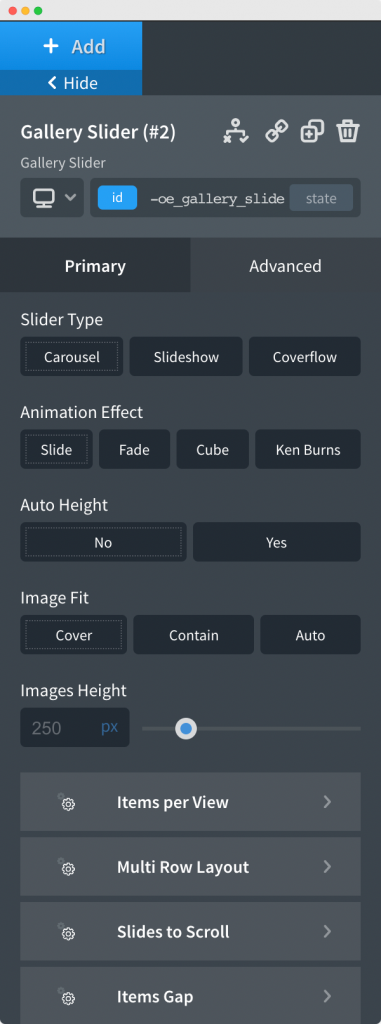
The height of images that are being displayed in slider can be set manually or you can enable the Auto Height option if you wish that the image sizes are adjusted automatically.
Further, there are options like Items per View, Items Gap, Slides to Scroll, and Ken Burns Settings that you can further use to customize the Gallery Slider.
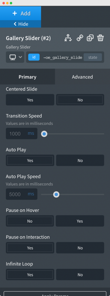
The Slider Settings tab contains general settings for the slider like Pause on Hover, Infinite Loop, Pause on Interaction, Slide Autoplay, Slider Speed and Centered Slide. You can use these settings to control the slider properties of the Gallery Slider Element.
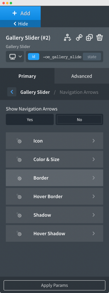
The Navigation Arrows section, as the name suggests, is used to enable/disable the arrows for the Slider. The section also has options to style the arrows, for example, Arrow Icon, Color and Size of the Arrow, Border, and Shadow of the Arrow, etc.
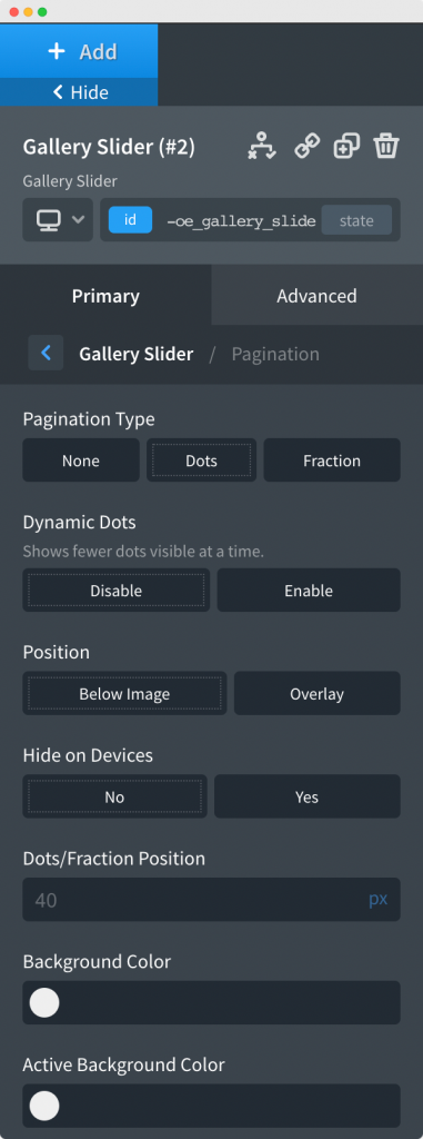
As the name suggests, Pagination tab contains option to choose between 2 Pagination types: Dots and Fraction. Once you choose the Pagination type, you'll further see options to style and cutomize the Pagination, like, color, size, position of the Dots or Fraction.
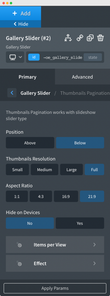
In the Thumbnail Pagination tab, you have the option to enable or disable the Thumbnail Pagination. Thumbnail Pagination is basically small pagination of thumbnails of slider images rolling above or below the main slider. In this tab, you can further customize the number of pagination, position, aspect ratio of pagination, and effects for Thumbnail Pagination.
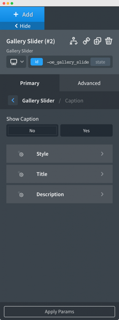
Caption Tab: This tab contains the options to show or hide captions of the images present in the Gallery Slider Element. You can further style the color, font size, and typography of the captions here.
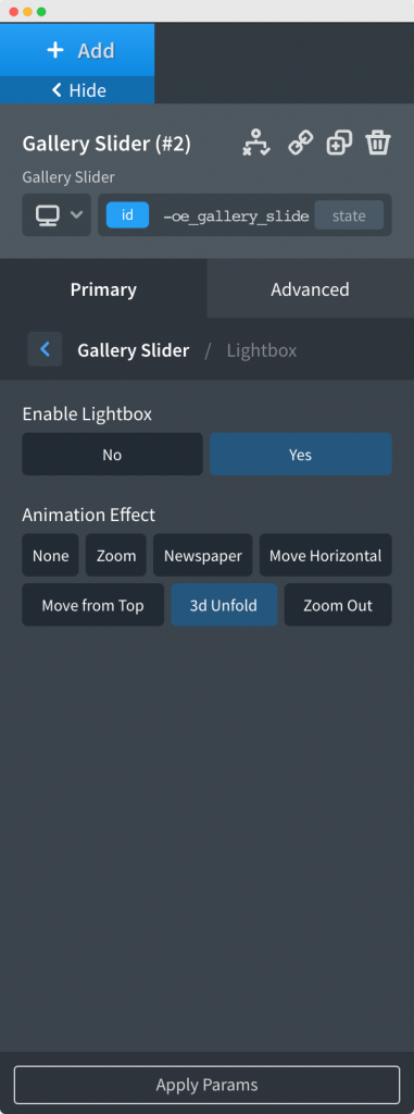
Lightbox Tab: This tab contains the options to enable or disable the Lightbox for the Gallery Slider. If you have enabled Lightbox, then any image in the gallery slider will open in a Lightbox if you click on the image.
This was all about the Gallery Slider Element. Feel free to get in touch with us in case you have any concerns regarding the Gallery Slider Element.