Creating a stunning image gallery on your Oxygen websites is super easy with the help of OxyExtended Image Gallery Element.
In order to understand how the Image Gallery Element works, let's have a detailed overview of the Image Gallery Element.
The Image Gallery Element consists of 5 tabs:
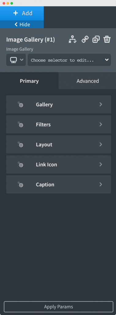
Let us go through the options available in each of the tabs one by one.
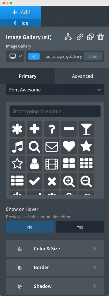
As the name suggests, this tab is used to add images to the element in order to display them on the front end of your site. In the Image Gallery element, we can add images from Media Library, ACF, ACF Repeater field, and WooCommerce.
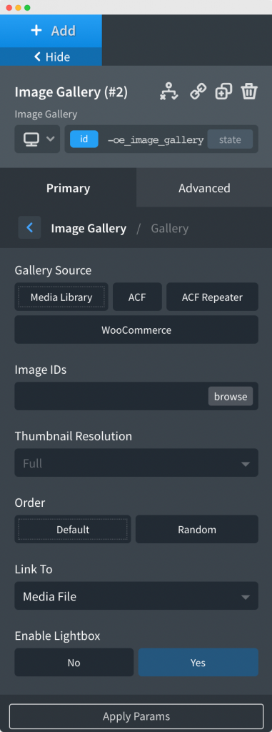
Apart from that, we can set the resolution of the images from the "Thumbnail Resolution" section, link the images to either the Attachment page or the Media file using the "Link To" section, and order the images by default or set the images to be displayed in random order with the help of "Order" option.
As mentioned earlier, we have a "Link To" option in the Gallery tab which is used to link the images to either the media file or the attachment page. If we choose the "Media File" option in the "Link To" section then, another option with the name "Enable Lightbox" appears.
As the name suggests, if we enable the lightbox, the images in the gallery will load in a lightbox when we click on them.
The next tab in the Image Gallery section is Filters. An important point to note here is that the Filters only work when the source of the images in the gallery is ACF Repeater.
In the Filters tab, you can also change the typography, color, font-weight, and other font properties of filter text. Further, you apply margin to each filter using the "Margins" option in the Filters tab.
As the name suggests, in the Layout tab, you can choose the layout in which the images in the gallery will be displayed on the frontend. There are 3 types of layouts available in the Image Gallery element: Grid, Masonry, and Justified.
Going further, the next section in the Layout tab is "Aspect Ratio". Here you can choose the ratio of the images in which they are displayed in the gallery.
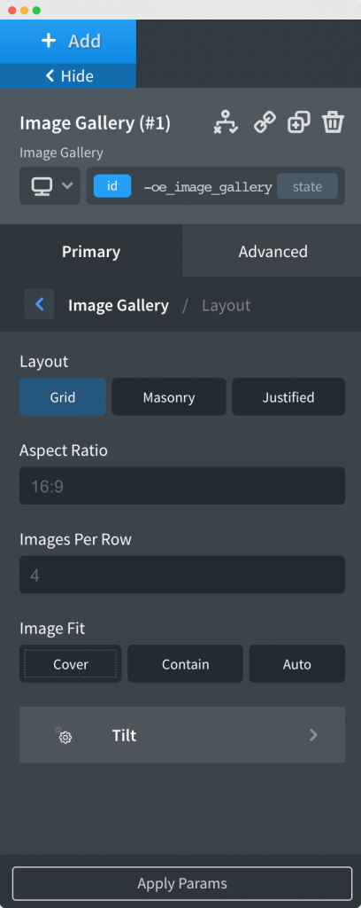
After you've chosen the Aspect Ratio for your images, you can select the number of images that you want to show in a row and the right fit for the images present in your gallery using the "Images Per Row" and "Image Fit" options respectively.
If you scroll down further in the Layout tab, you'll see a Tilt tab. It can be used to add tilt effects to your images. The tilt effect is seen when you hover over the images.
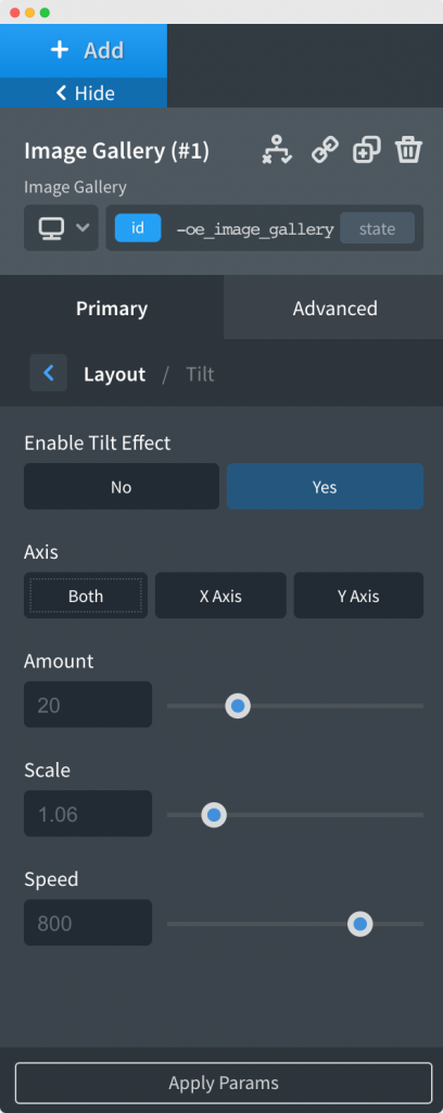
If you click on the Tilt tab, you'll first see the option to "Enable Tilt Effect". Once you enable that, you'll further have options to apply the Tilt effect on either X-Axis, Y-Axis, or both. Next, you can choose the amount of tilt that you want to apply to the images, how much you want to scale the image while hovering over it, and the speed of the tilt.
In this tab, you can choose the Icon that you'd want to appear on your images. It is totally up to you whether you want to display an icon on your image or not.
Further, you can customize the icon by changing its background, background hover color, color and hover color, size, and padding. You can also apply all the border properties like width, color, style, and radius. The last section of the Link Icon tab is "Shadow". As the name suggests, it is used to apply box-shadow to the Link Icon.
As the name suggests, this tab is used to show/hide the caption of the image in the Image Gallery element. Once you click on the Caption tab, you'll see options to Show Caption, Show Description, Caption Position, aligning captions Horizontally and Vertically.
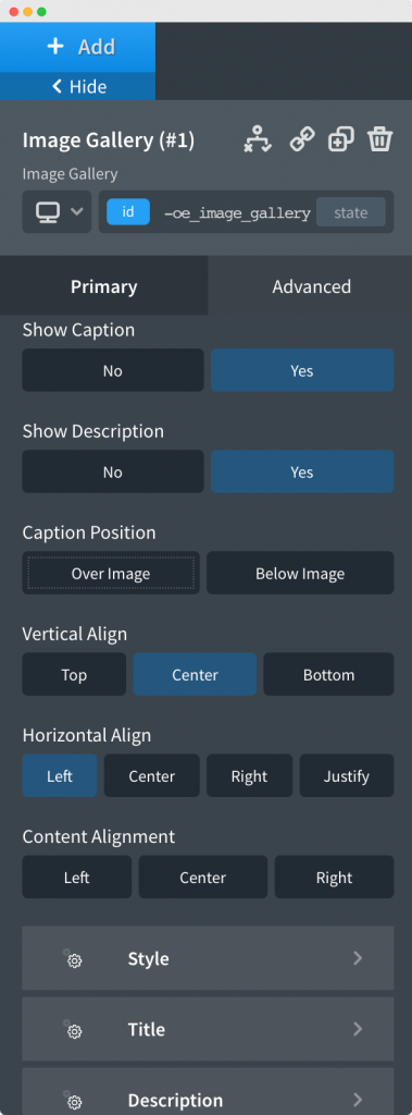
You can also style the caption of your images by applying padding and background color to your caption. Further, you can change the typography, colors, and apply margins to the Caption using the Title and Description tab inside the Caption tab.
This was all about the Image Gallery element of the OxyExtended Plugin. Feel free to get in touch with us in case of any concerns regarding the plugin.